

You don't know cos you weren't there man!!!!!
Carefully google it and wear sunglasses you'll need them.
I'd link something but I can't go back too many bad memories 😳
In all seriousness though I think is does show how making something too childish can also damage its appeal to children.
It wasn't just all the red(and boy there was a lot) it was the time satire became slapstick and the Grimdark was actually pretty bright.
BoLS Lounge : Wargames, Warhammer & Miniatures Forum
Results 111 to 120 of 155
-
08-11-2015, 12:09 AM #111Brother-Captain

- Join Date
- Mar 2013
- Location
- Her Majesty's United Kingdom
- Posts
- 1,344

Last edited by grimmas; 08-11-2015 at 12:16 AM.
Knowledge is knowing a tomato is a fruit
Wisdom is knowing not to put it in a fruit salad.
-
08-11-2015, 01:12 AM #112Chapter-Master
- Join Date
- Jul 2014
- Posts
- 3,541
I Googled it and all I could find were threads like this saying how bad it was, but not speaking about it directly. It's a bit like Voldemort's reign of terror in that regard. :P
Read the above in a Tachikoma voice.
-
08-11-2015, 01:57 AM #113Chapter-Master
- Join Date
- Jun 2012
- Posts
- 23,683
Overstated nonsense

Red Era was, effectively, 2nd Edition.
And it was great.
Boo. Boo to you hobby hipsters and you're attempt to non-red wash history with you revisionist drivel! MY RAZORBACK TURRETS ARE RED. RED AND PROUD!
BOOOOOOOOOOOOOOOOO! BOO I SAY!Fed up for Scalpers? https://www.facebook.com/groups/1710575492567307/?ref=bookmarks
-
08-11-2015, 02:45 AM #114First-Captain
- Join Date
- Jun 2014
- Location
- The North, UK
- Posts
- 1,627
"Red Period" was peak GW, that was the GW that gave us Necromunda, painting was bright because that stood out on the battlefield and looked glorious, better than the 3rd edtion when everything was black, brown and grey!
Its pre Grim Dark (as in Grim Dark the meme where its exaggerated to the point of ridiculousness that we have now) and the satire was always very heavy handed
-
08-11-2015, 03:03 AM #115Chapter-Master
- Join Date
- Jul 2014
- Posts
- 3,541
Ah...I didn't like that stuff either. Too goofy for my taste.
Read the above in a Tachikoma voice.
-
08-11-2015, 06:37 AM #116Chapter-Master
- Join Date
- Jun 2012
- Posts
- 23,683
Oh yeah?
Well see that?

That's you, that is.Fed up for Scalpers? https://www.facebook.com/groups/1710575492567307/?ref=bookmarks
-
08-11-2015, 06:50 AM #117Chapter-Master
- Join Date
- Jul 2014
- Posts
- 3,541
Not a hipster, just a young'un. :P
Another note with regards to, "stuff for kids is bad," is how it dovetails with, "things for women are bad," to make, "things for girls are so horrendous that no-one should ever watch them." The sad thing is, there's so little effort spent on the latter category that it's normally true...Read the above in a Tachikoma voice.
-
08-11-2015, 07:35 AM #118First-Captain
- Join Date
- Dec 2012
- Posts
- 1,997
I just hated the Red Period for the following reasons:
Goofily disproportionate sculpts; everything had massive hands and heads, even by the already crazy standards of heroic scale.
Note, for example, that here, the hands are the same size as their head. Madness.
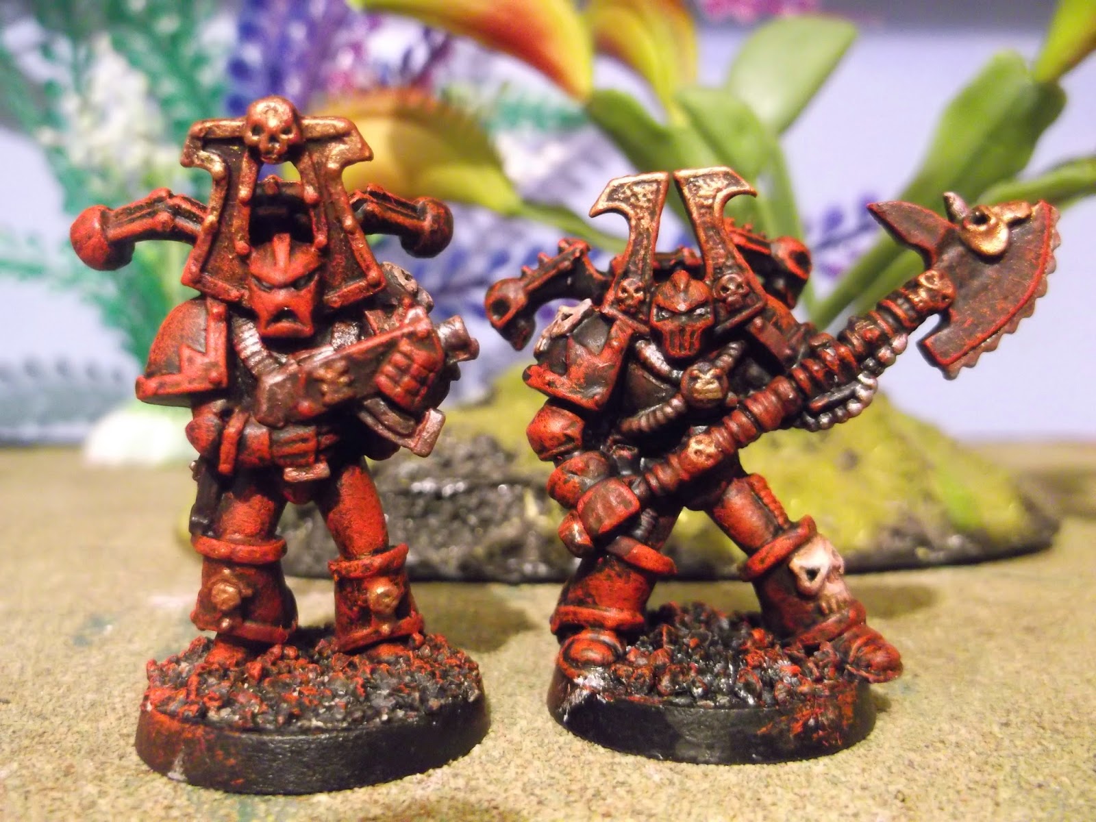
Everything was red, which sounds okay, until you realise that it was only one shade of red: a brilliant crimson. This was frequently paired with a bright green, even/especially if this went against the fluff. Hence, the first Khorne Berzekers (that came after the single Jes Goodwin marine sculpt) having crimson armour with bright green piping. They looked like chainaxe-wielding Christmas Elves.
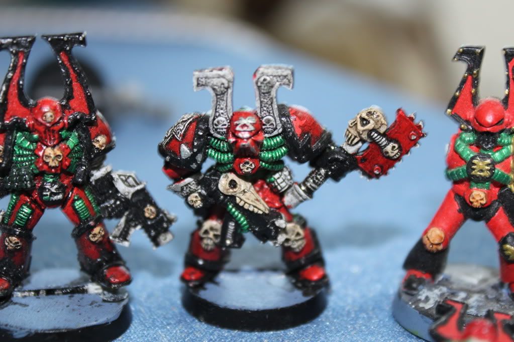
Contrasting colours on everything. Hence the Ultramarines from that era look like Happy Meal toys: bright blue armour, bright red guns, bright yellow bandings/aquilas. All primary colours, all the time.


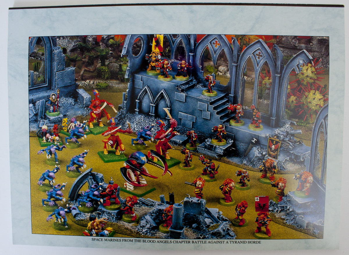
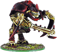
And if you were an alien species, you got it worst of all. The Tyranid army has more colours than a Pride parade.


And a kind of comedic look to everything. All the early metal Tyranids were from that era, and they just looked stoopid. They were supposed to have terrifying fanged maws, but basically looked more like Beavis and Butthead laughing at a fart joke.
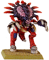
Basically, it was a low-point for the company aesthetically, both in terms of sculpting, and in terms of colour choices.Last edited by YorkNecromancer; 08-11-2015 at 07:41 AM.
AUT TACE AUT LOQUERE MELIORA SILENTIO
-
08-11-2015, 08:07 AM #119Chapter-Master
- Join Date
- Jun 2012
- Posts
- 23,683
Ooooh! Revisionist Hipster

Wasn't a low point in contemporary terms - their models continued to improve throughout that period
Though the second metal Carnifex was bobbins.Fed up for Scalpers? https://www.facebook.com/groups/1710575492567307/?ref=bookmarks
-
08-11-2015, 08:18 AM #120First-Captain
- Join Date
- Dec 2012
- Posts
- 1,997
I don't necessarily think 'improve' is the right term. The strange proportions seemed like a very deliberate stylistic choice. Not to mention, Gary 'Original Flavour Nagash' Morley was doing loads of work for them then. I know some people love his work, but I think I've hated literally every model he's ever done. That he was responsible for like, 90% of the Necromunda miniatures is a good reason I haven't sought them out. Originally Posted by Mr Mystery

For me, the 'line in the sand' that kind of marks the end of that goofy aesthetic and the move towards the new, relatively more credible one, is the plastic Carnifex kit. That was actually the model that got me back into 40K after a decade away from it. Just an astonishing sculpt, and just so far removed from those horrible old Tyranids that it might as have come from an entirely different army. Much closer to Jes Goodwin's original designs as well.AUT TACE AUT LOQUERE MELIORA SILENTIO

 Reply With Quote


