

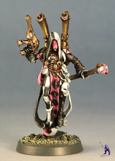
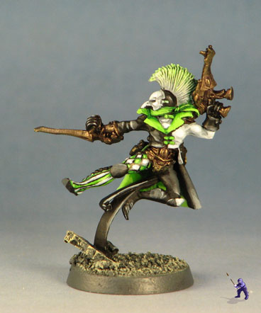
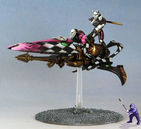
These Harlequins were started up as an allied force to a set black leather clad [url=http://www.dakkadakka.com/dakkaforum/posts/list/682450.page]Dark Eldar.[/url]
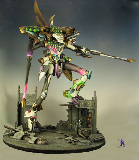
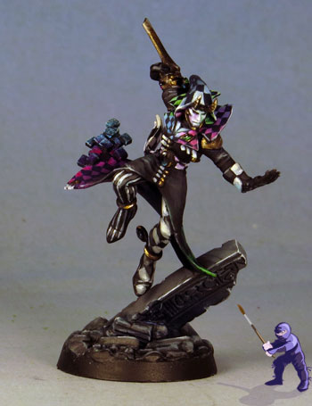
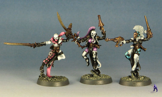
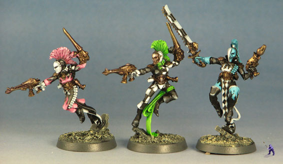
You might notice that the bright colors they use are all the same ones as the anime hair from the DE. The concept for this force was that most of them would be in black and white, with only one color on each harlequin. The pattern was broken on the centerpiece minis (the solitaire and titan) who use a little of every color in their scheme.
BoLS Lounge : Wargames, Warhammer & Miniatures Forum
Results 1 to 4 of 4
-
03-04-2016, 10:41 AM #1Librarian

- Join Date
- Jan 2010
- Location
- Orem, UT
- Posts
- 829
 Harlequin Mime force by Garden Ninja Studios
www.GardenNinja.com
-
03-04-2016, 03:51 PM #2Librarian
- Join Date
- Jul 2009
- Location
- South Jersey!
- Posts
- 781
I really like how using just a single "anime" color makes these Harlies pop. It's less distracting than the usual riot of color you see, but still very Harlie.
-
03-05-2016, 05:29 AM #3Brother-Sergeant
- Join Date
- Jan 2015
- Location
- Suffolk, UK
- Posts
- 86
I was thinking the same thing, this scheme is far more pleasing to the eye and is inspiration for my own Harlis, thought I will never do them justice like this. Originally Posted by Drew da Destroya
 Sometimes I sits and thinks, and sometimes I just sits.
-
03-07-2016, 09:15 AM #4Librarian
- Join Date
- Jan 2010
- Location
- Orem, UT
- Posts
- 829
In terms of composition, it is difficult to get a ton of colors onto a mini and still have it end up looking nice. If you look over the GW official color schemes, they use a surprising amount of black on their harlequins.
With these folks, I pulled back a little farther than is necessary (for effect).
Zach Lanier once told me to limit myself to three non-neutral colors for a mini- up to two main colors and one accent color (so grey, brown, black, white, skin tones and most metals don't count).
I've actually found this to be pretty helpful. I think you can pull in a fourth color if you've got other strong composition principles working, but mostly, I think keeping it down makes for better composed minis and an overall stronger feel.
There's just so much risk with harlequins to end up looking like a muddy mess of colors, you know?
www.GardenNinja.com


 Reply With Quote

